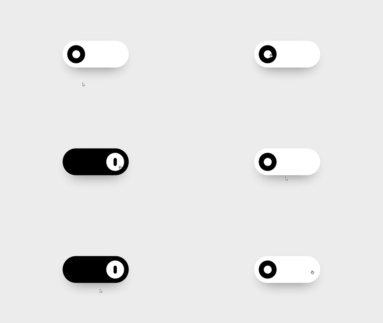
A few lines of css code can bring your website some amazing stuffs you can't imagine!

CSS is the language for describing the presentation of Web pages, including colors, layout, and fonts. In easy words, the colors, styles, orientation we see on any website is the result of using css (Cascading Style Sheets). CSS can be tricky but if you can perform the trick well enough, then you should get some amazing results which will make your website look cool.
QUICK NOTE: If you're in a hurry and need the solution ASAP, then go straight to the bottom of this page.
Before we start, if you don't know basics of css & html, then you should first check out some beginner tutorials. If you have no prior knowledge of html and css, then check out this place called HTML Dog
For html beginner lessons: HTML Dog Beginner html
For css beginner lessons: HTML Dog Beginner css
If you already know html & css or just completed the basics, then start from here!
HTML ~
First of all add this html codes in your html file.
1 | <!-- Floating button --> |
Open the html file in browser. You should see a checkbox in your browser. Let's see what we did here:
1 | <!-- Floating button --> |
This line is comment in html. That means this won't be executed by browser but it'll remain in the code.
Comments are important to remember the purpose of the codes, for example, you'll always remember that the the codes below this line are used for the floating button in your site.
Rest of the codes should be pretty familiar to you as they're very basic html to add a checkbox input.
CSS ~
Now add this css codes in your css file.
1 | /* Floating Button */ |
First line is comment in css, yes, it's different from html. Rest of the codes are for getting a basic button in the down right section in your browser where you opened the html file. If you don't see the button, refresh your browser.
Now let's hide the checkbox from button with this code. Add this under your previous code.
1 | .switch input { |
Add the slider window on the button with these lines of code below. This will look like an oddly square shape first. But don't worry, we gonna fix this in a bit.
1 | .slider { |
Now add a button on that square slider window. If you click, you'll see color changes after each click.
1 | .slider:before { |
To make the button slide, add these codes below.
1 | input:checked + .slider:before { |
If you click on the button now, you'll see the button slides from one side to another. Let's resize their shapes to round with these codes below.
1 | .slider.round { |
Refresh your browser and you should see a beautiful button you just created!
Total Codes are here ~
HTML
1 | <!-- Floating button --> |
CSS
1 | /* Floating Button */ |